Employee onboarding for an all-in-one benefits platform
Gleam, Health Insurance for Small Business Owners
Health Tech Onboarding Web app
Context
Gleam is an all-in-one benefits platform for small business owners. Gleam helps small business owners both enroll in benefits for the first time or manage rising insurance costs with benefit options that don’t break the bank. They also offer the addition of HRA accounts - a great employee perk! I worked directly with their CEO and Founding Engineer. I served as Product Design Lead.
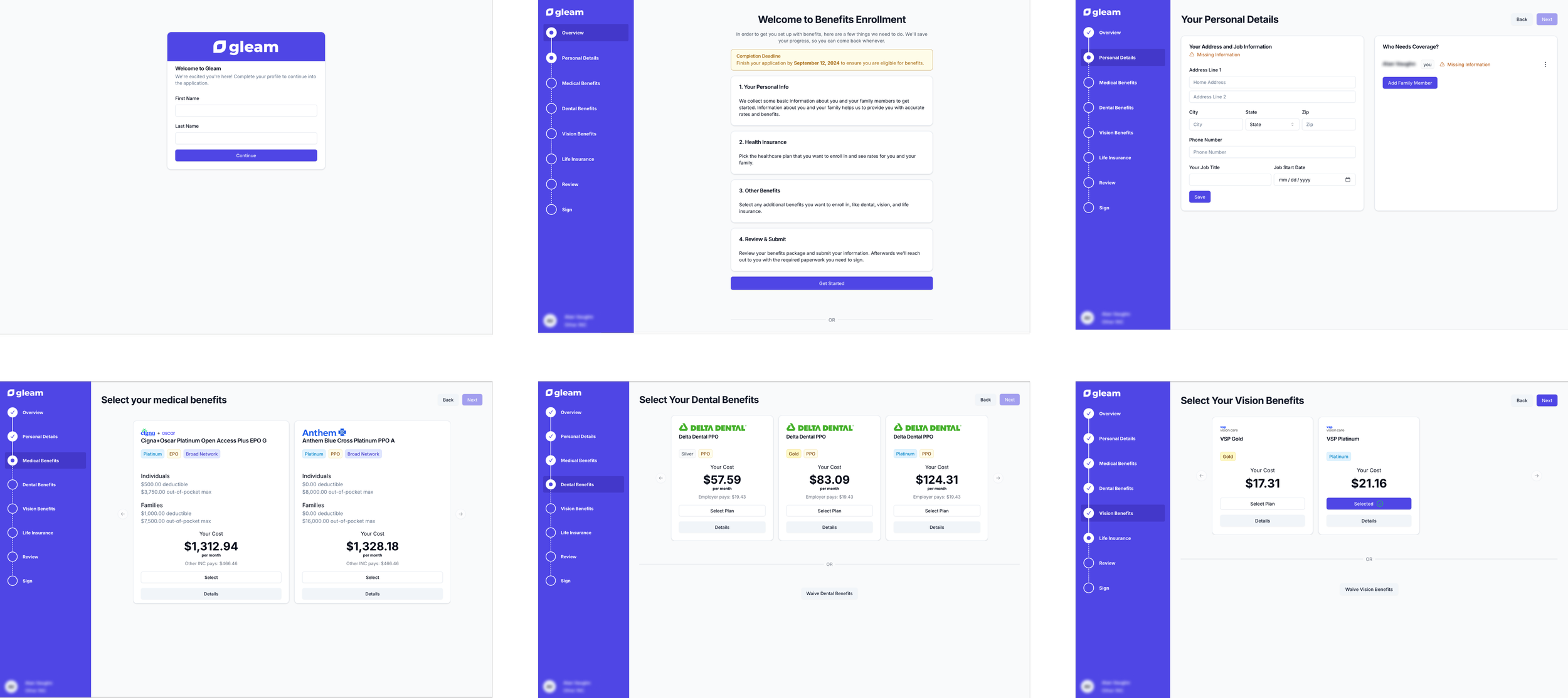
Some screenshots from the existing onboarding experience
The Problem
When I began working with the team, they had been managing to put things together without design support. As they added more features and inputs to the onboarding experience, they realized that it became overly complex and not very intuitive to fill out. In addition, they wanted to combine two existing separate products (enrolling in benefits + HRA enrollment) into one experience.
There were no existing design files so I was starting from scratch. I needed to solve existing UX issues, add additional features, and create design files from zero.
Existing UX issues:
Users had to click through many screens
A whole page with a very long convoluted explanation of the process
Confusing UI that indicated missing information before being prompted to input that information
UI that only showed two medical plans to choose from at a time (then the user had to continually push the next arrow)
Additions to experience:
Allow users to compare plans
Allow users to sort medical plans by carrier
Allow employees to see the offering and benefits of the HRA offered by their employer plus enroll in an HRA account
Craft a navigation bar that will allow for future growth
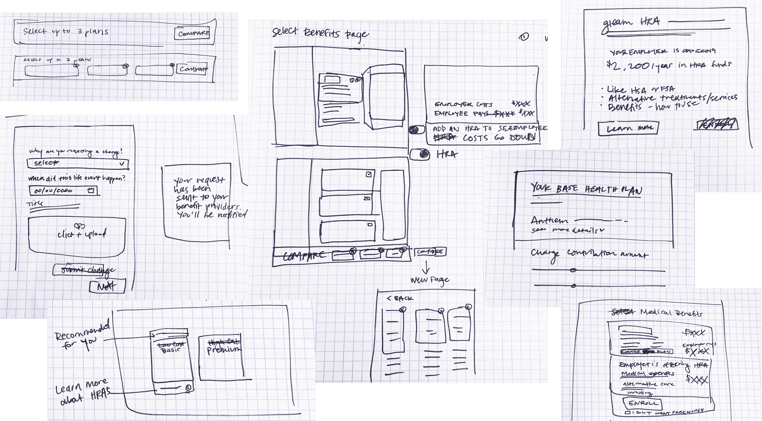
A few sketches from the brainstorming & wireframing phase
Process
I started by looking at a few competitors, to see what they did well and what to avoid. Then I started sketching and wireframing. I presented a first draft to the team and received helpful feedback. In round two, I created an interactive prototype to show how employees would progress from page to page. With additional feedback, I put the final touches on development-ready mockups, including an updated prototype.
Results
I delivered an updated employee onboarding experience that fixed the UX issues and added new desired features. This project’s output is currently in development and will launch soon!
Check out a few key highlights below:
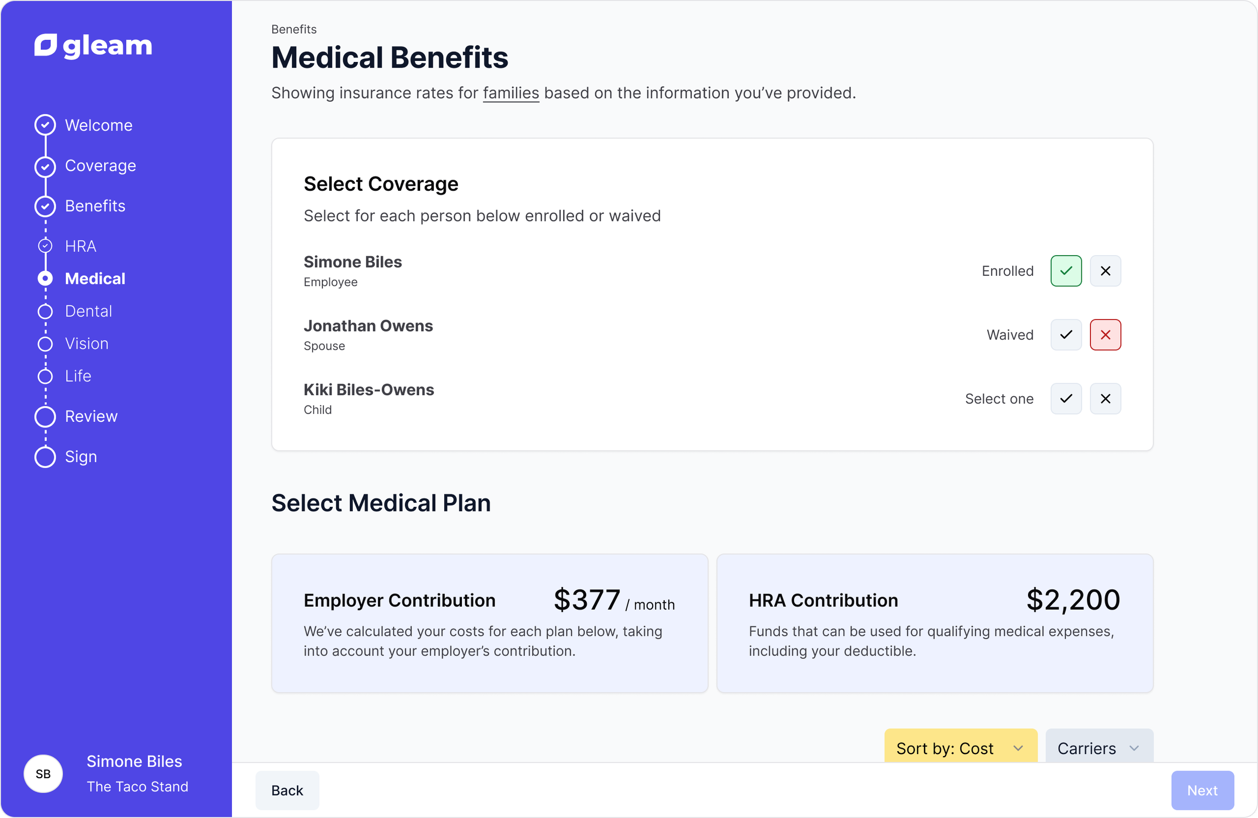
The new medical benefits page allows employees to opt themselves and their dependents into specific benefits vs waiving all benefits at once (the current experience).
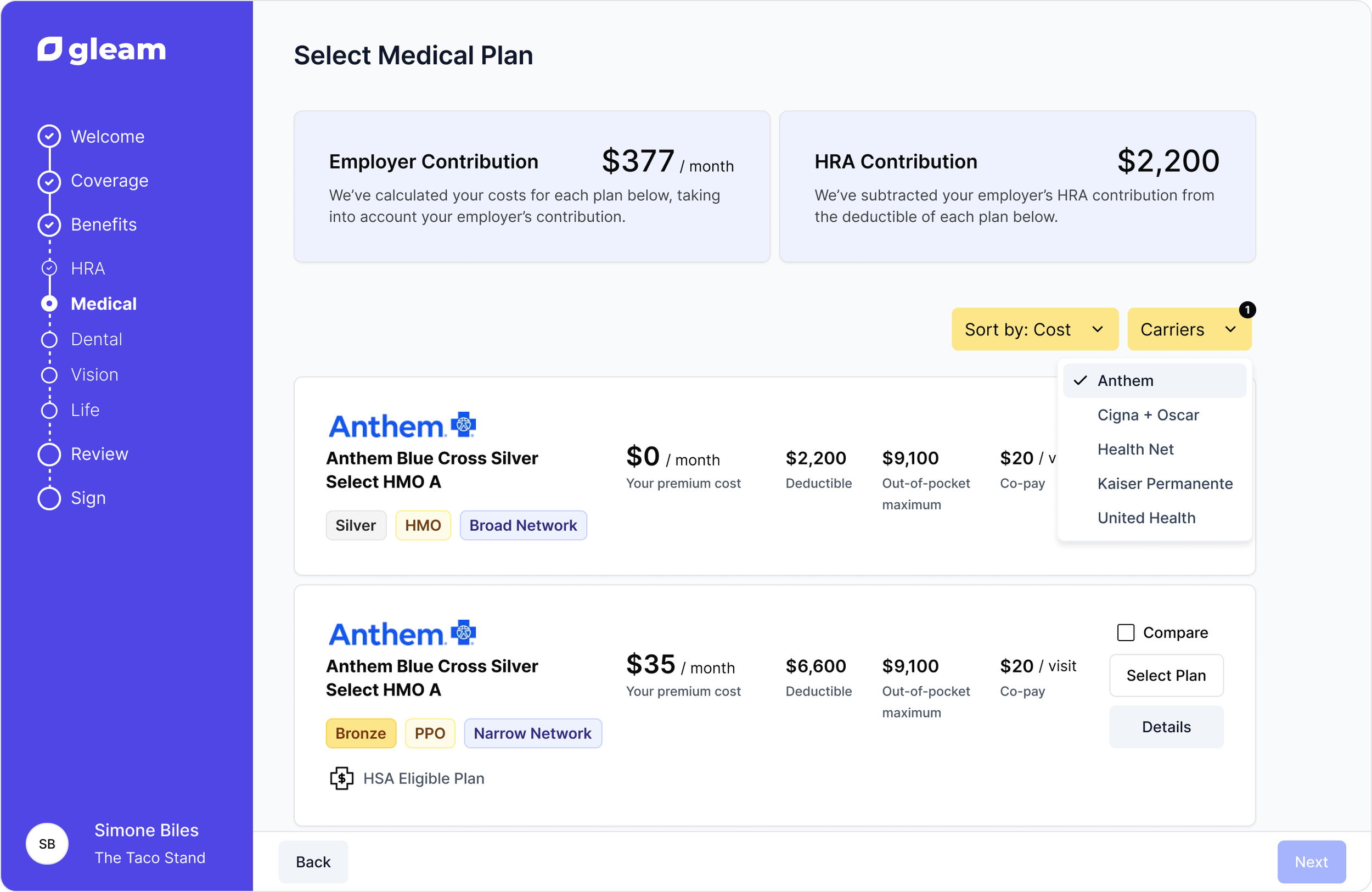
Updated the UI to a vertical scroll so employees can see multiple plans at once. Added the ability to sort plans by different costs and by carrier.
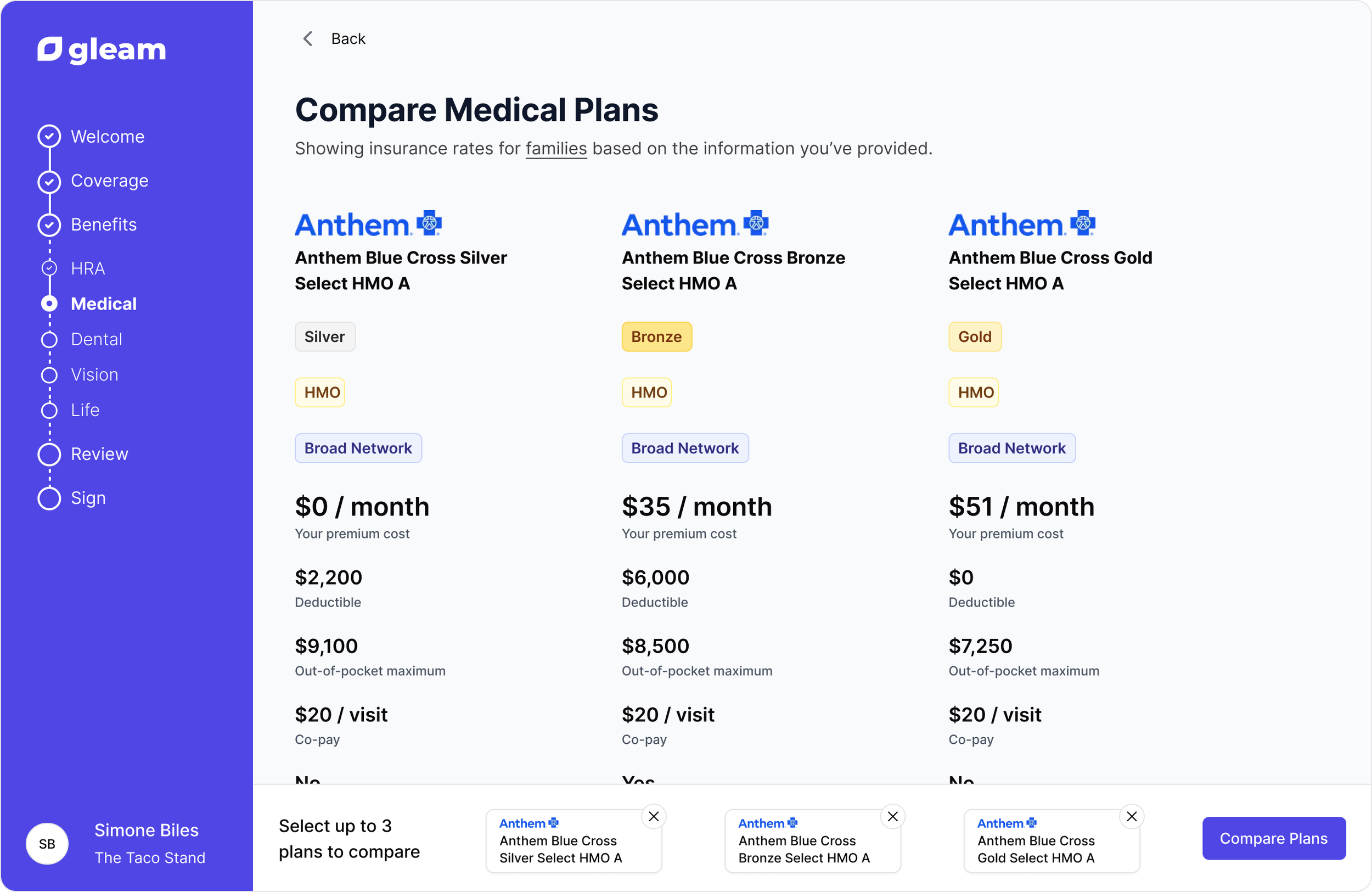
Now employees can select plans they’re interested in and compare multiple plans side by side, including all the detailed information for each plan.
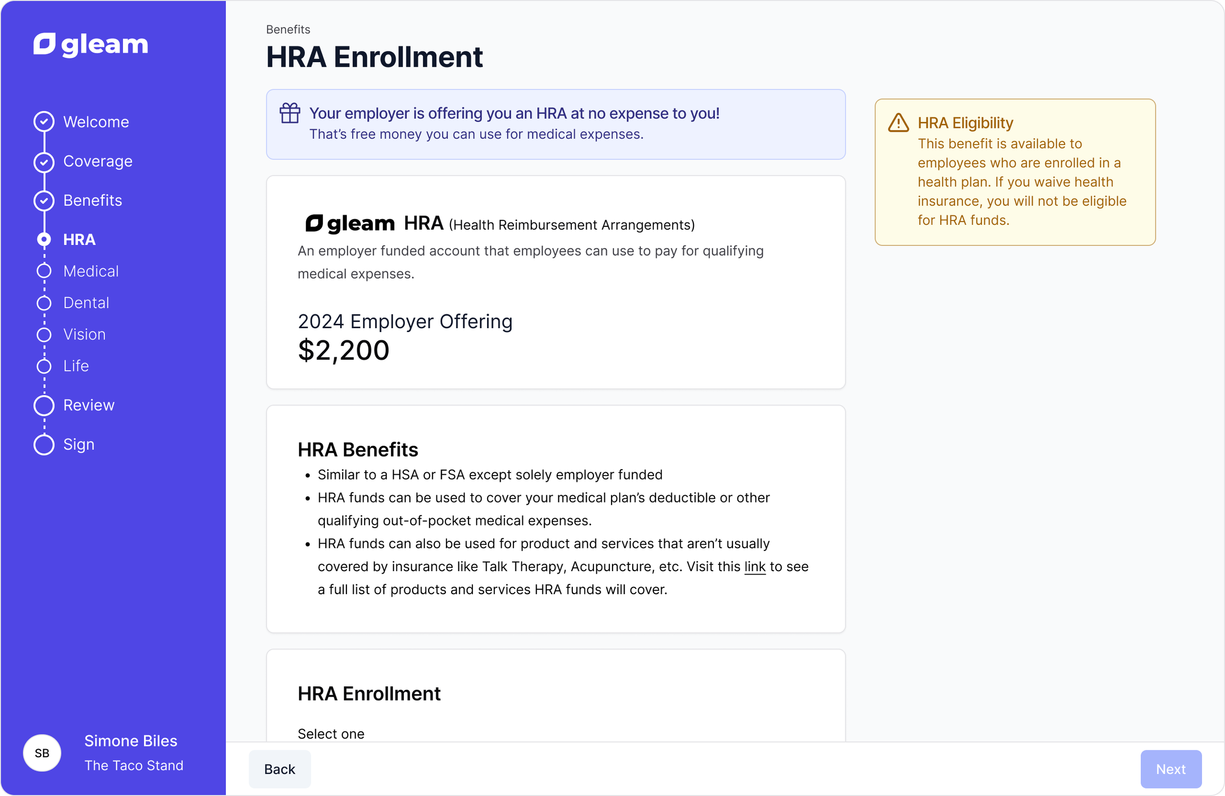
Added an HRA page to explain the offering and benefits of HRAs plus allow employees to enroll.
To view the employee onboarding prototype click here.